Shadow parts in Ionic
When components were rewritten as web components in Ionic 4, many of them started using Shadow DOM to isolate their internal markup. This allowed the internal markup to be changed in newer versions without affecting the application code and markup. However, this also means that components can only be customized as much as the CSS custom properties provided allow.
In Ionic 5, many components exposed their internal markup as shadow parts, so it was again possible to fully customize it. This proved very useful when I reimplemented the date picker popup behavior in Ionic 6. When you put the date picker in a popup, it broke the default styling for invalid inputs on Android.
I used Angular reactive forms with validation:
ngOnInit(): void {
  this.form = new FormGroup({
    date: new FormControl(undefined, [Validators.required]),
    text: new FormControl(undefined, [Validators.required]),
  });
}
I placed the ion-input elements inside ion-item elements:
<form [formGroup]="form">
  <ion-item>
    <ion-label>Pick date</ion-label>
    <ion-input
      value="{{ form.controls['date'].value| date: 'dd.MM.yyyy' }}"
      id="date"
      readonly="true"
      class="ion-text-end"
    ></ion-input>
    <ion-popover trigger="date" size="cover">
      <ng-template>
        <ion-datetime
          presentation="date"
          formControlName="date"
          locale="sl-SI"
        ></ion-datetime>
      </ng-template>
    </ion-popover>
  </ion-item>
  <ion-item>
    <ion-label>Enter text</ion-label>
    <ion-input formControlName="text"></ion-input>
  </ion-item>
</form>
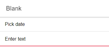
For the plain text inputs, this is enough to get a red underline rendered if the value is invalid. But for the date picker it does not work, because it is not placed directly inside the ion-item element:
To fix this, I first tried adding code to manually apply the CSS classes for the red underline:
<ion-item
  [ngClass]="{'ion-touched': form.controls['date'].touched, 'ion-invalid': !form.controls['date'].valid}"
>
  <ion-label>Pick date</ion-label>
  <ion-input
    value="{{ form.controls['date'].value| date: 'dd.MM.yyyy' }}"
    id="date"
    readonly="true"
    class="ion-text-end"
  ></ion-input>
  <ion-popover trigger="date" size="cover">
    <ng-template>
      <ion-datetime
        presentation="date"
        formControlName="date"
        locale="sl-SI"
      ></ion-datetime>
    </ng-template>
  </ion-popover>
</ion-item>
Unfortunately, this did not work reliably because the ion-input element inside the ion-item interfered with the classes. So instead of adding the Ionic CSS classes, I added one of my own:
<ion-item
  [ngClass]="{'popover-invalid': form.controls['date'].touched && !form.controls['date'].valid}"
>
  <ion-label>Pick date</ion-label>
  <ion-input
    value="{{ form.controls['date'].value| date: 'dd.MM.yyyy' }}"
    id="date"
    readonly="true"
    class="ion-text-end"
  ></ion-input>
  <ion-popover trigger="date" size="cover">
    <ng-template>
      <ion-datetime
        presentation="date"
        formControlName="date"
        locale="sl-SI"
      ></ion-datetime>
    </ng-template>
  </ion-popover>
</ion-item>
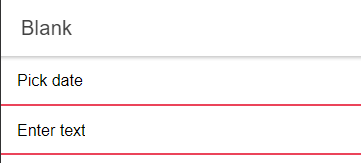
There were no problems with this class. But now I had to add the styling for the red underline myself. This is where the shadow parts saved my day, because they allowed me to style the internal markup of ion-item that was responsible for the red underline:
:host-context(.md) ion-item.popover-invalid::part(native) {
  border-bottom-color: var(--highlight-color-invalid);
  border-bottom-width: 2px;
}
This CSS selector selects the shadow part named native with the ::part() selector and applies custom styling to it when it's inside my custom popover-invalid CSS class. It also ensures that this only happens on Android by using the ::host-context() selector.
This achieved the desired result:
You can see the full source code for a working example in my GitHub repository.
I do not think there was much talk about shadow parts when they were added to components in Ionic 5, although they can be very useful when you need to customize the appearance of Ionic components and the available CSS custom properties are not enough. All shadow parts of a component are listed on its documentation page.
