Positioning Ionic popovers
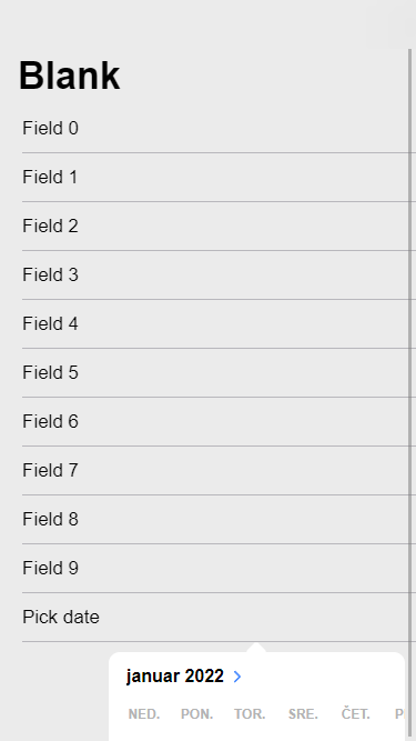
In a recent blog post, I described how to make the date picker in Ionic 6 more similar to the date picker in previous Ionic versions if you put it in a popover. However, the default positioning of the popover is not perfect for all situations. If you open it from a page that can be scrolled because not all the content fits on the screen, it's entirely possible that the popover will not be fully visible:
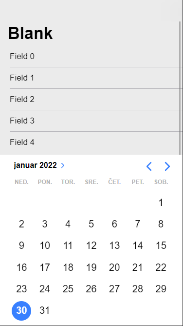
Fortunately, there is a way to adjust the positioning of the popover by taking advantage of CSS shadow parts. I chose to always place it at the bottom of the page, which is how the date picker worked before Ionic 6:
The usual way to apply custom styles to the popover is to assign a custom CSS class to it. However, if you use a trigger to open the popover declaratively, the class appears to be lost after the popover is first closed, which results in the custom style not being applied when the popover is reopened.
A possible workaround is to set id instead. This value is not lost, so the custom style is applied correctly even if the popover is opened and closed multiple times:
<ion-popover trigger="date" size="cover" arrow="false" id="popover-bottom">
  <ng-template>
    <ion-datetime
      presentation="date"
      [(ngModel)]="date"
      locale="sl-SI"
    ></ion-datetime>
  </ng-template>
</ion-popover>
I also disabled the arrow, which is rendered by default on iOS, since it would no longer be placed properly.
To affect the positioning of the popover element, I applied the styles to its content shadow part:
ion-popover#popover-bottom::part(content) {
  top: unset !important;
  left: 0 !important;
  bottom: 0;
  width: 100vw;
  border-radius: 0;
}
This positions it at the bottom with full width and no curved edges. The !important property is used with top and left properties to override the values set programmatically by Ionic.
To center the date component within the popover and match its background with the popover background, I had to set a few more styles:
ion-popover.popover-bottom ion-datetime {
  margin-left: auto;
  margin-right: auto;
  --background: white;
}
And that's it. The popover is now always fully visible, regardless of where the triggering input component is on the screen.
You can see the full source code in my GitHub repository.
Thanks to the CSS shadow parts, Ionic components can still be heavily customized with CSS, even though they take advantage of shadow DOM. And this can be achieved without relying on CSS classes used internally by Ionic, which increases the chances that the styles will not break with the next major release of Ionic.
